
Over the past few years, Google Fonts has grown and evolved into one of the top sources for typefaces. It’s free, it’s easy — and it’s loaded with fonts of mediocre quality. (We’re designers —we’re allowed to judge.) That said, it’s popular for a reason, and there are some really nice options available.
In the old days, there were but a few different ways to get your typefaces. You could spend thousands of dollars on officially sanctioned collections from the big font foundries; you could traffic in the seedy world of free downloadable fonts, which often featured free viruses as well; or you could simply “borrow” fonts from a friend, coworker, client or vendor. After all, who’s gonna know?
Thankfully, Google Fonts presents a great option that works in many situations — an option that designers are turning to with increasing regularity.
What Is Google Fonts, and Why Use It?
Google Fonts is a large library of free-to-use fonts that you can download or load straight from Google to use on your own website. They have a variety of fonts, styles and weights available, and their collection continues to grow. Also handy: Google will tell you the impact on your page speed based on the fonts you select. Nice!
There are a number of enticing reasons to use Google Fonts.
- It’s reliable and tried-and-true.
- Since they’re free, you don’t have to pay to use the font on your site. Some commercial fonts require a one-time fee, while others price per year or even based on your traffic.
- If the font your brand uses has a subscription for online use that your company can’t afford, you can often find similar alternatives from Google Fonts.
- Because Google tells you the impact on speed from your selections, it encourages you to make good choices. You don’t want to use every font weight on your site, and you shouldn’t. But without someone to tell you otherwise, it can be easy to upload all of them without a second thought!
- It’s easier to experiment. If your startup hasn’t decided on fonts at all yet, Google Fonts can be great for testing combinations. You don’t have to commit and can easily swap one out if you change your mind.
Google Fonts and Page Speed: What You Need to Know
Whether you load the fonts from Google’s server or your own, it’s still going to impact how quickly your site loads — but that doesn’t mean you can’t minimize the impact.
- Load only as many fonts and weights as you need. Absolutely no more! Don’t load any your site doesn’t actually use.
- Load the fonts and weights in a single call. Google lets you list multiple fonts at once, separated by a vertical line (|). If you load each in its own individual import script, this creates more work for the server as it loads them one at a time.
- Google’s import script is render-blocking. That means it blocks the rest of the page from loading until the fonts load. Loading the font with Javascript from the footer of your page instead of the head will help, but there are even better alternatives. For best results, use Web Font Loader or a WordPress plugin such as Easy Google Fonts or TK Google Fonts.
How Many Fonts Are OK?
Avoid picking more than three font weights. One font for headlines and one for body is great. Browsers can do a pretty good job of rendering italics and a bold weight without you having to load those as well. Unfortunately that isn’t always the case; some fonts you will want to load a “black” or “extra bold” weight to use in place.
In those instances, be particular and only load the one additional weight you need. If both the bold and italics rendered don’t look good, try using only the bold and avoiding using italics altogether. Does it really need to be italicized? Or can it be bolded, highlighted or underlined instead?
Be critical and minimalistic about how you approach fonts. You will not only keep your page loading time lean, but you’ll keep your design clean as well.
The Best Fonts of Google
These fonts are free because they’re the JV team, but that doesn’t mean we can’t find some great players among them. Here are my favorite diamonds in the rough — the best Google Web Fonts available.
Best Sans-Serif Fonts

Like Myriad? Then you’ll love its free doppelgänger Source Sans Pro, with its wide variety of weights and great readability at any size. Being used in over 4 million sites, it has to be good.

A thoughtfully-designed and well-balanced geometric sans typeface. It may not be as popular as some others on this list, but Poppins has wonderful multilingual support if you need it.

Available in a host of styles and weights, Lato lends a modern, friendly look to text of any size. No wonder 8 million sites use it!

A humanist sans which includes a broad range of special characters and plenty of weight options. A safe can’t-go-wrong choice, Open Sans is the most commonly used font on this list at over 18 million.
The Best Serif Fonts

A great body copy font with some old-world flavor, Alegreya has nice bold versions for headlines to boot and is featured in over 250,000 websites.

A readable serif font in the classic vein, Merriweather is ideal for body copy. It’s used by over three million websites and popular in many countries.

This slab-serif typeface is great on its own, but can be used along with its extended family as well, which includes Roboto (the sans-serif base variant), Roboto Condensed and Roboto Mono. While not as used as much as Merriweather, Robot Slab is a good pick across other countries too.

A strikingly elegant and readable option that works best for big headlines, but is versatile enough to use throughout a project. Playfair Display is immensely popular, used in over three million websites.
The Best Decorative and Specialty Fonts

A sans-serif font with a modern, even futuristic, look that’s distinctive enough to list it here rather than with the more run-of-the-mill sans typefaces. Given it’s specific look, Exo is not widely used — which might be what you’re looking for.

A distinctive, versatile and well-balanced typeface for bold headlines. Abril Fatface even supports over fifty languages.

A perfect name for this font which softens a hard graphic look with a more casual and feminine handwriting style. Architects Daughter is used primarily in the US and is also the least used font on our list.

Plenty of ligatures and alternate characters make for a beautiful, bold and fun script font. Lobster occasionally gets a bad rap as being overused, but it’s actually pretty average and much less popular as many serif and sans-serif fonts we previously mentioned.
Font Combinations: What Works
When choosing your fonts, pay attention to what purpose you’re using it for and how they will work together. For body text, readability should be your first concern. Avoid cursive, rough handwriting, and other heavily decorated fonts. Sticking with a serif or sans-serif font is safest. For the heading font, you want one that contrasts. If you body font is sans-serif, try a serif or specialty font for the headline or vice versa. If your body font is thin and light, pair it with a bold font. Here are some examples from our collection of best fonts:

Lobster is bold and distinct, giving a nice cursive flow to the headline. Source Sans Pro supports it by being a neutral sans-serif font, keeping all the “flavor” on Lobster.
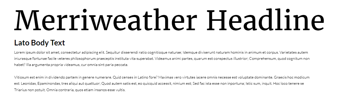
Lato supports the classic authority of Merriweather without getting in the way.
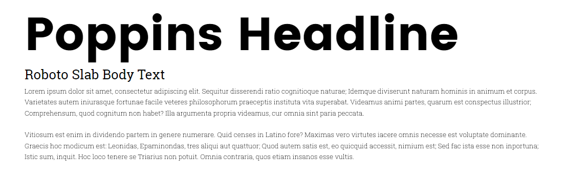
Using the heaviest weight for Poppins as the headline and a lighter weight for Roboto Slab creates a look that feels both modern and friendly.

I don’t normally pair two serif fonts together, but using Abril Fatface as a large and bold headline can still effectively contrast with Alegrey’s lighter and more consistent look.
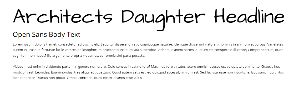
Architects Daughter gives the headline a bit of a fun, artsy pop, but Open Sans keeps the primary text legible — exactly as it should be.
For more font pairing ideas, fontpair.io has their own list of recommendations or use font-combiner.com to mix and match live. Google will also give its own suggestions.
Fonts Beyond Google
Of course, you’re almost always going to get the best quality if you go to the pros and pay for your fonts. Beautiful, professional fonts designed by the best type foundries can be downloaded in minutes from sites like MyFonts.com or FontShop.com, at only a fraction of what they used to cost.
You still want to be cautious of load time and file sizes, but font foundries will give you optimized files for any format. Since these fonts aren’t as widely used as those Google, you can be sure your site will have a unique touch others lack — even if their eyes aren’t trained to see the difference.
The old adage that you get what you pay for certainly applies in the typeface market. For top-notch, well-constructed fonts, there’s still no substitute for shelling out a few bucks for the best. If brand consistency is a priority and your business has the cash, always get the web versions of your brand fonts and use them over a free alternative.
If the budget isn’t in the cards, you can probably find something pretty close to it for free on Google Fonts. And for those projects that don’t require that amount of finesse, you can be sure Google will be there in a pinch to get something presentable together fast.
But whether you decide to browse the vast collection of free fonts are pay for something special, always choose your fonts with care.
Source: http://blog.madisonmilesmedia.com/blog/best-google-web-fonts
